Driving Dashboard Adoption Through Better Data Visualization and Design

Reshared with permission from Keith Smith - Senior Partner Sales Engineer at Snowflake
Far too many BI [dashboards / applications / reports / solutions / data visualizations… pick one] fail to be adopted and end up “on the shelf,” leaving some of our most important business stakeholders struggling to stay informed and minimizing the value of their analytic technology investments
Introduction
I recently had the unique opportunity to present at Snowflake Summit. In my role as a Senior Partner Sales Engineer at Snowflake, I am privileged to work with a large number of our Business Intelligence Technology Partners. These tools are often closest to the business user and where business users are seeing and interacting with data, often through reports, dashboards, data visualizations, apps, or whatever you want to call them.
Prior to joining Snowflake, I worked as a Lead Consultant and Pre-Sales Engineer for a boutique data consulting firm and one of the top BI solution providers in the world. I developed and published hundreds of customized business intelligence solutions for Fortune 500 clients across diverse industries, and worked hands-on with customers to communicate implementation best practices. I also acted as primary pre-sales & solution architect for client prospect meetings, leading software demonstrations for large audiences and developing proof-of-concept applications to help clients imagine the “art of the possible”.
I have spent years obsessively focusing on analytics for business users (first, as a business user myself, increasingly unsatisfied with the tools and solutions that I was presented with… later as a BI developer and consultant). This, in addition to the fact that Snowflake bills our customers based on usage of data storage, virtual warehouses (compute) resources, and cloud services — prompted me to spend some time gathering everything I have learned and share it with our customers at Snowflake Summit. We want you using those compute resources and we’ve seen that our most successful customers have no reservations about consuming Snowflake credits when the business benefits outweigh those costs. WE WANT GOOD CONSUMPTION!!
Below is a written summary of that presentation. I REALLY WANT EVERY SNOWFLAKE CUSTOMER, ESPECIALLY BUSINESS USERS AT ALL LEVELS, TO BE CONTINUOSLY GETTING MEANINGFUL INSIGHTS OUT OF SNOWFLAKE.
PREPARE
Before typing your first line of code, or connecting to your first data set, it’s extremely important to think about and have clarity around the following questions:
Stakeholders & Sponsors
• Who is sponsoring our project?
• Who will approve the final solution?
• What level of involvement will they have (and how often)?
• Have similar projects been attempted in the past? (Who, When, What)
• Who is the audience? (seniority, skillset, responsibilities, data literacy)
• What is the primary purpose of the final solution?
What does success look like? (MVP)
• What is our deadline?
We’ve all heard about SOFT SKILLS! Are you comfortable having conversations? Do you know your stakeholders? Do they know you? Take them out to lunch — bring in food to your kickoff session.
Get people comfortable, get them laughing, get them sharing.
DOES EVERYONE SHARE A COMMON DEFINITION OF SUCCESS??
It’s critical to align on the right metrics to measure and monitor the entire business and establish a consistent approach to business rules, logic, data sources, and methodology.
Actions
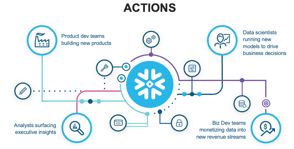
What types of actions are people taking? What are they responsible for day-to-day?
Spend more time with your stakeholders, asking questions and truly listening.
Build those personal relationships and understand people’s need for information beyond a single report.
FOCUS ON QUESTIONS, NOT ANSWERS. FOCUS ON IMPACTS, NOT INSIGHTS. BE A CONSULTANT, NOT AN ORDER TAKER
Screens & Devices
Where will the solution be viewed? For example, on a desktop or laptop computer? Mobile Device? Executive Board Room? Flat screen TV’s in the office? On the warehouse floor? Printed?

Will users be logging into the actual BI tool? Or using an embedded solution as part of their daily work activities? Will the application be integrated as part of a decision-making solution?
Data
How well do you actually know the data? Consider identifying and becoming best friends with the data expert(s). Get approval and sign-off from individuals before presenting design concepts, with numbers, to a larger audience. Stay ahead of possible objections or concerns about accuracy or data integrity.
Create architecture diagrams and be able to explain data lineage and business rules. Document and get written sign-off on business logic and calculation. Some BI teams are now adding special icons or imagery as their “stamp of approval”, or a business approval badge to all validated reports and dashboards, to boost user confidence and differentiate between final solutions and those still being developed and tested.

Become best friends with the data expert(s)
DESIGN & DEVELOP
Once we feel prepared, we can begin work on designing and developing the actual solution.
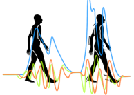
The Best Stats You’ve Ever Seen
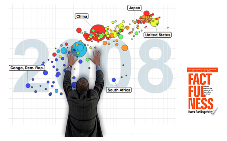
Hans Rosling at his best
Hans Rosling passed away in 2017, but his book “Factfulness” (released around the same time) is one of the best books I’ve ever read! And his 2006 TED Talk “The Best Stats You’ve Ever Seen” is still very inspiring.
Over the years as I have presented many of these concepts to various organizations, I would often show them a brief clip from this video (2:10–4:55)
And then I would always ask the question, was this an effective presentation?
Most people would agree this WAS a very effective presentation.
And I would ask “Why?”
And most would agree that Hans Rosling is very knowledgeable and passionate about the topic, is an effective communicator, presenter and data storyteller.
And then I would ask, “What type of chart was used?” (Scatter plot — Displays correlations — we can see whether or not, and in what direction, two sets of quantitative values are correlated)
And we would discuss whether this chart was an effective data visualization? And the reality is that, it might depend upon the viewer. I have really grown to love the scatter plot, but I have also spoken with many business users who are less familiar with scatter plots and may find them confusing.
So, as you continue reading, I want you to really remember that! Human beings are complex creatures, and changing behavior (for example asking someone to change the way they work by adopting a new solution, or change they way they think about successful launches of an application, with continuous updates and improvements) can sometimes be difficult.
So much of this is very subjective. If I were to survey every reader of this article and ask you to name their favorite restaurant, or type of cuisine, or type of music, or band/group — I would get wildly varying responses.
I believe the industry has landed on some generally accepted best practices, written about and taught by various thought leaders (who often disagree amongst themselves!), that may in actuality require modifications or adjustments for your particular business, audience, timeline and budget.
What Role Do You Play?
Another well known author in this space, Alberto Cairo, wrote a book called “The Functional Art” where he interviewed Hans Rosling and asked the question: “What can designers and journalists learn from the success of Gapminder?” (the name of this organization he founded)
Hans answered “Our main goal should be to transform complex data into information. Let me give you an analogy. Mozart was a wonderful composer; Steinway was the best piano maker of his time; and, today, there are a lot of musicians who use Steinway pianos to bring to life what Mozart once wrote.”
So, how do you see yourself?
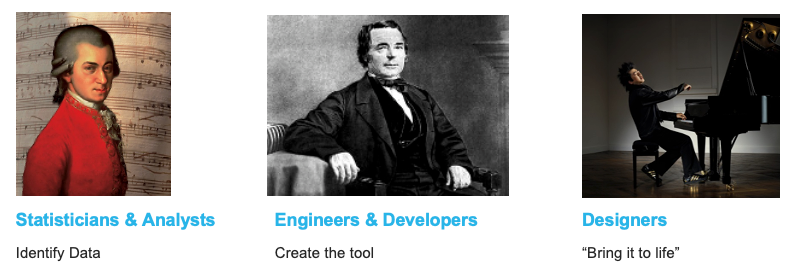
Which hat do you normally wear?
Usually in this field I interact with people who would classify themselves as a mix of the first two. The rest of this article will focus on bringing some of the “designer” mindset into how we prepare and present information.
Dashboards
In his book “Performance Dashboards”, Wayne Eckerson reminds us there are different types of dashboards, for different audiences: Strategic, Tactical, and Operational. (which one are you developing?)
Distinguished University Professor and computer scientist Ben Shneiderman taught us the “Visual Information Seeking Mantra”, which I have committed to memory and repeated hundreds of times with teams of business users I have consulted with:
“Overview first,
zoom and filter,
then details-on-demand.”
Business Intelligence
Wayne Eckerson’s book “Secrets of Analytical Leaders” describes two fundamentally different approaches to generating insights.
Top Down
- Reporting applications for casual Users
- Also known as “business intelligence”
- Monitor business activity using metrics
Bottom Up
- Ad Hoc inquiries by power users
- Business analysts, statisticians and data scientists
- Explore data, test hypotheses, and answer unanticipated questions
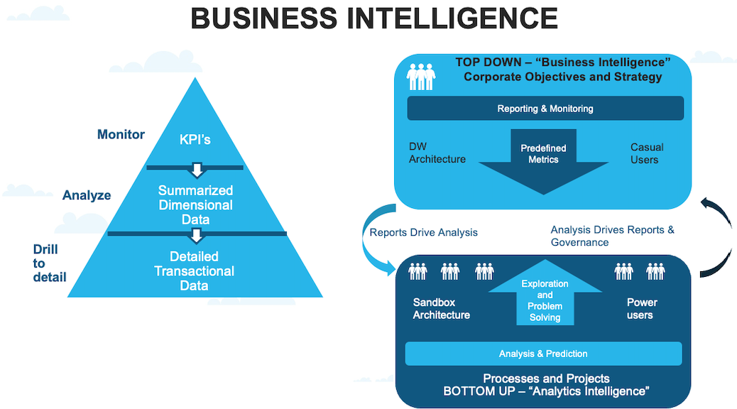
Top Down vs Bottom Up approaches for insight generation (Wayne Eckerson)
These two approaches support different users, workloads, design frameworks, and architectures; yet, they are interrelated.
Analysis leads to reports, and reports trigger new questions that require analysis. Companies that harmonize top down and bottom up approaches to generating insights succeed with analytics.
The focus of this article is more closely related to the “top down” BI. Applications that we develop and then publish for others (hoping they adopt our solution!)
Approach & Keys to Adoption
During the many years I spent consulting, I discovered that my clients were more likely to adopt solutions that met these 3 criteria.
Functional — Informative — Engaging
In the design world, Form follows function.
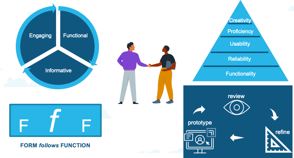
Functional
- Fast & Accurate
- Progressive Disclosure (Information Overload)
- The right information, to the right user, at the right time
Informative
- Data Visualization best practices
- Effective charts & objects
- Context, highlights, appropriate level of detail
Engaging
- Attractive yet subtle colors & imagery
- Proper variety, layout, placement
- Bringing order to complexity
I also got in the habit of always spending adequate time to understand the data and prepare in advance for that very first conversation, and have a few design mockups and wireframes ready to discuss.
I have found things go much more smoothly and it’s always easier to modify and change something that we can see together (versus starting with a blank screen or blank whiteboard and asking: “OK, where should we start?”)When there are a lot of participants, those can be really hard conversations and progress is difficult.
Then, we would get into a nice rhythm of presenting updates and progress on the original prototype, reviewing and continuing to refine. (while not losing sight of our original, agreed upon definition of success)
Those sessions should occur pretty close together, but also should not go on forever. You’ve got to keep your momentum!!!
Guiding Principles
While staying informed and appreciative of modern and exciting, eye-catching design that will ENGAGE your audience, it’s important to stay true to your goals of being data-driven , focused on turning data into useful information through attractive, modern applications & visualizations.
One of the favorite books I have on my shelf is called “Universal Principles of Design”, which changed the way I work and approach new projects.
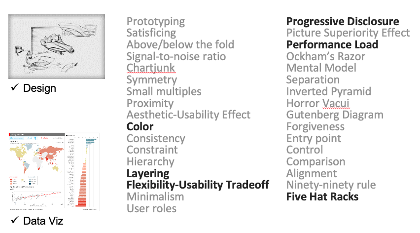
Each of these has relevance when designing solutions to present information
I didn’t have time at Summit to discuss all of these, and so chose just a few to focus on.
Color
Color is used in design to attract attention, group elements, indicate meaning,
and enhance aesthetics.
- Can make designs more visually appealing and aesthetic
- Can reinforce the organization and meaning of elements in a design
- If applied improperly, color can seriously harm the form and function of a design.
In Edward Tufte’s book “Envisioning Information”, he said the first principle in bringing color to information is to AVOID CATASTROPHE. “Above all, do no harm”. If one limits strong, heavy, rich and solid colors to the small areas of extremes, then expressive and beautiful patterns occur. He also suggests using colors found in nature — they are familiar and coherent, possessing a widely accepted harmony to the human eye. I have found https://colorbrewer2.org/ a wonderful resource to come up with various color schemes.
Five Hat Racks
The Five Hat Racks principle says there are 5 ways to organize information: Location, Alphabet, Time, Category, & Hierarchy. (I would often just choose a few of these in my first wireframe concepts that I presented to business users, as a way to start the discussion)
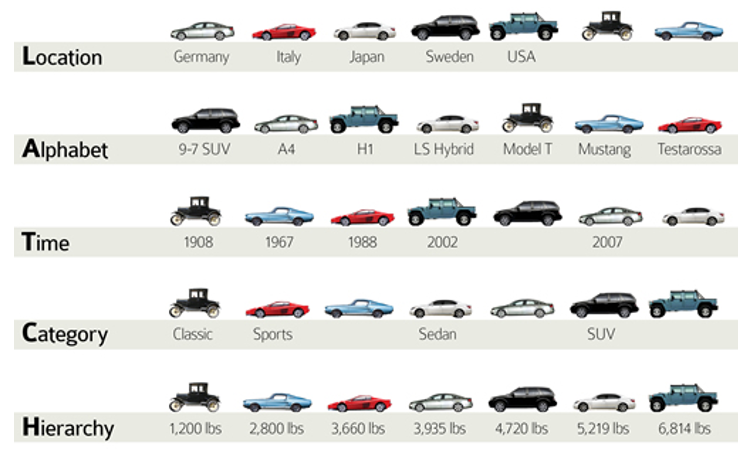
Ways to organize information
Flexibility-Usability Tradeoff
No application can do everything — if it did it would be unusable! Carefully consider the purposes of each application and establish boundaries around the inclusion of data and functionality.
The Flexibility-Usability Tradeoff principle states that
- As the flexibility of a system increases, the usability of the system decreases
- Flexibility has real costs in terms of complexity, time, and money
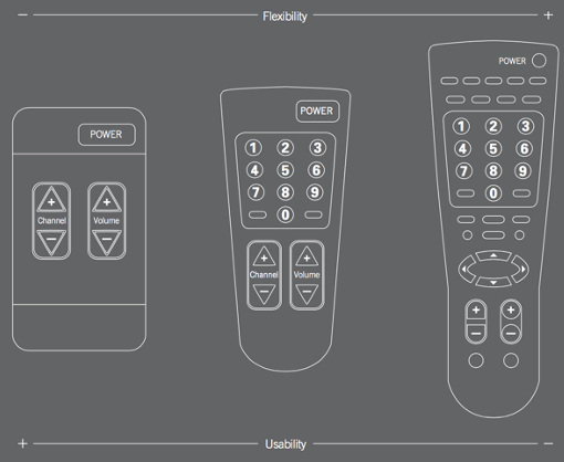
Flexibility-Usability Tradeoff
Performance Load
This principle states that the greater the effort to accomplish a task, the less likely the task will be accomplished successfully! What type of performance load does your solution place upon the user?
- Cognitive Load: the amount of mental activity required to accomplish a goal. (think Perception, Memory, Problem Solving)

- Kinematic Load: the degree of physical activity to accomplish a goal (think Number of steps or movements, Amount of force, Mouse clicks, Time waiting!!!!!!)
Progressive Disclosure
How should you think about managing information complexity in which only necessary or requested information is displayed at any given time? PROGRESSIVE DISCLOSURE, of course! Which helps keep displays clean and uncluttered, and helps people manage complexity without becoming confused, frustrated, or disoriented.

Progressive Disclosure helps keep displays clean
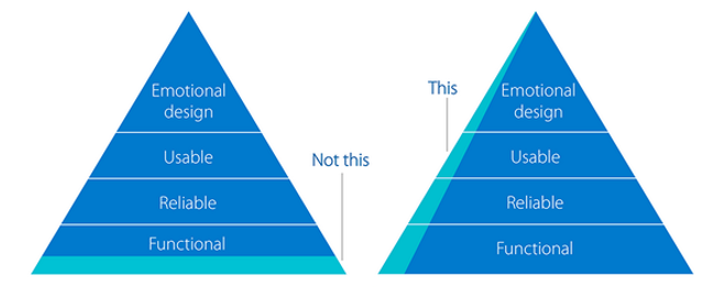
Minimum Viable Product (MVP)
During my years of consulting projects where I worked with teams of smart, driven executives, often with lists of requirements that were always growing, I would often work towards getting consensus on a “minimum viable product” before getting too far into a project.
I found that solutions that satisfied each level of the design pyramid, or “design hierarchy of needs”, were most likely to be adopted.
Again, though, functionality is the foundation of this pyramid and should never be sacrificed. Get something successful out the door, and then continue modifying as necessary. KEEP YOUR MOMENTUM
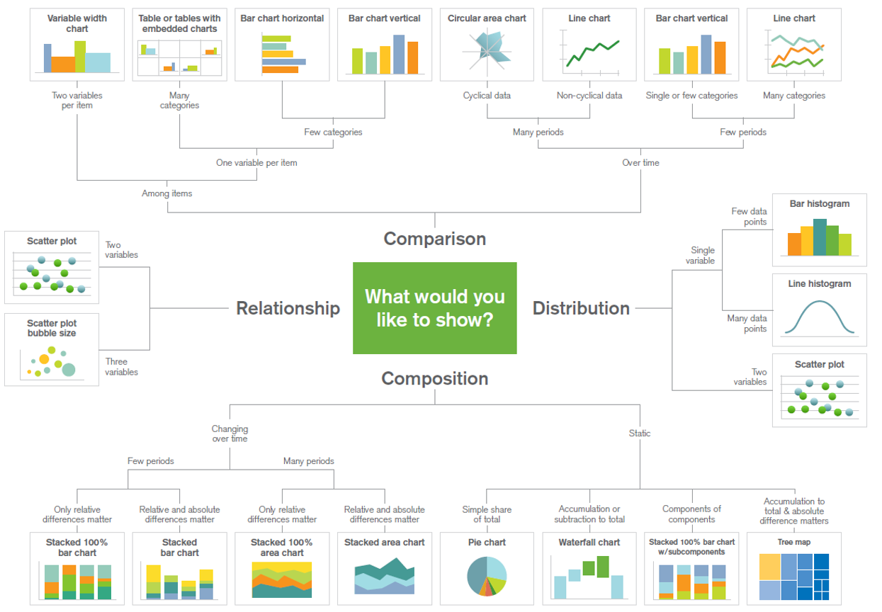
Data Visualization
What type of analysis is being performed? This should drive the selection of charts and visuals that are included. A lot of software products on the market include quite a few chart types that are actually pretty terrible. And they often won’t always guide you to make the best choices. Variety is important but should never override sound data visualization principles.
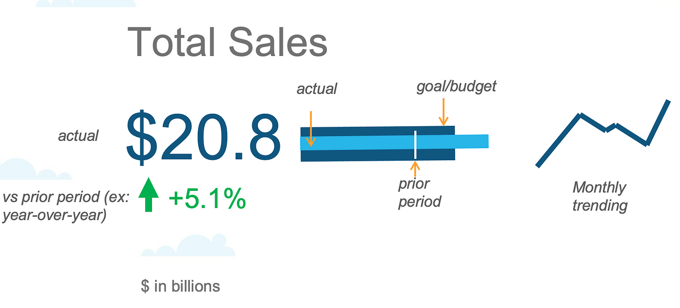
KPI Design
Over the years I noticed several common themes start to emerge across my clients, and found a simple KPI template was a good starting point for each metric.
In general, everyone seems to be interested in:
- current total (rounded, does not need to be precise)
- variance vs. prior period (ex: last month, last quarter, last year)
- how we’re tracking against budget
- historical trend
THIS ONE FITS NICELY INTO THE “OVERVIEW FIRST” portion of our data visualization mantra
THEN, YOU MIGHT CONSIDER SLICING IT UP DIFFERENT WAYS BY ONE OR MORE DIMENSIONS (ex: Five Hat Racks — Location, Category, Hierarchy) as you ZOOM AND FILTER.
Popular KPI Design
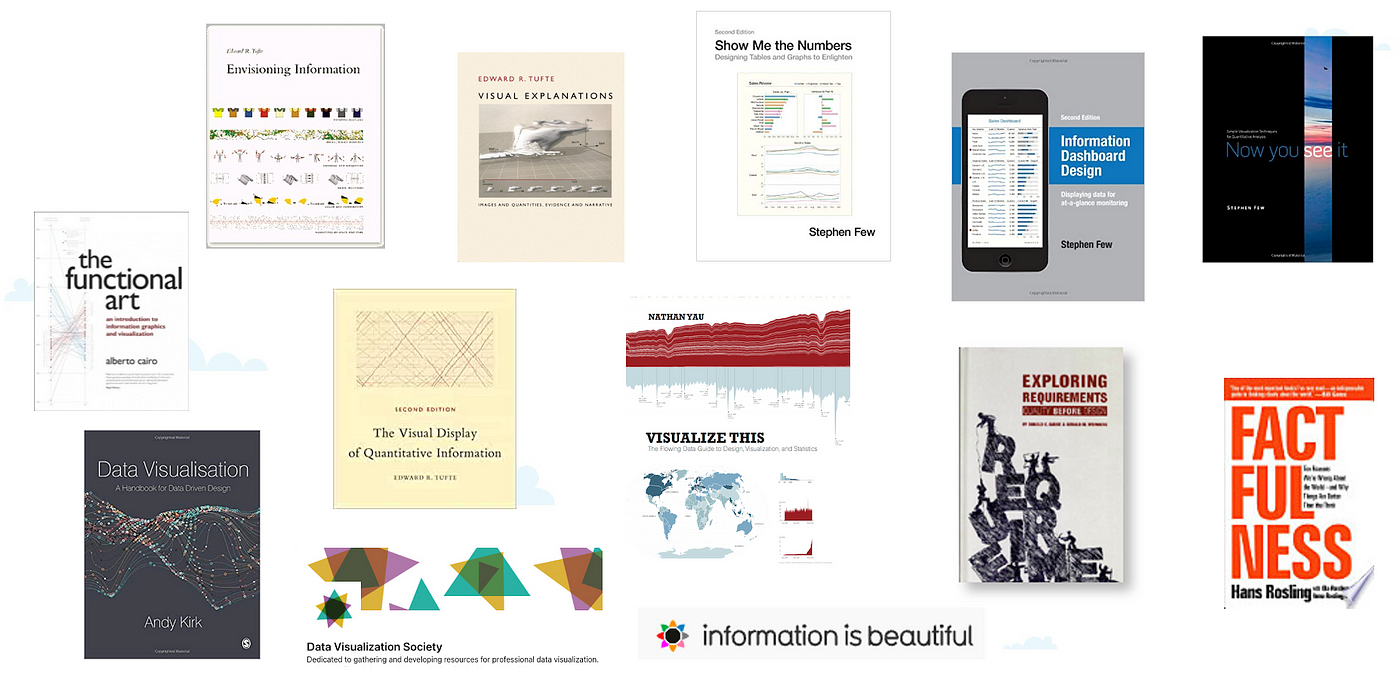
Stephen Few has been an invaluable resource in my own learning, and has helped influence decisions I have made with clients on different chart types and dashboard design proposals.
In fact, everyone who works in this field should come up with their own library of go-to resources as they look for inspiration and guiding best practices. Here are a few of my favorites:
DELIVER
Communicate
Once you’re done developing and are ready to launch, how do you do that, exactly? Don’t be afraid of asking for guidance here — your sponsors and stakeholders should be involved. IT SHOULD BE MORE THAN JUST AN E-MAIL!!!
Is training required? Put the right amount of effort into that also but too much training may actually do more harm than good. The solutions should be simple!
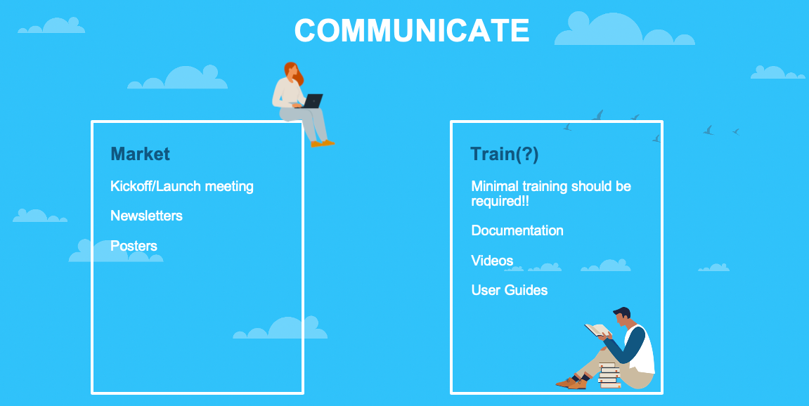
Think about the right way to launch your solution!
Follow up
OK!! So, you’ve launched, adoption is looking good, data validation has passed…
Now what?
Stay on top of it!!
Just because the data was accurate and passed user testing upon initial rollout, doesn’t mean it will stay that way!
Your solutions require constant nurturing and feeding. You might also find ways to monitor data quality using an automated data observability solution like Monte Carlo, Anomalo, or Bigeye. These are becoming increasingly popular with our clients as they seek to maintain the confidence and trust of business users. AVOID DATA DOWNTIME!!!
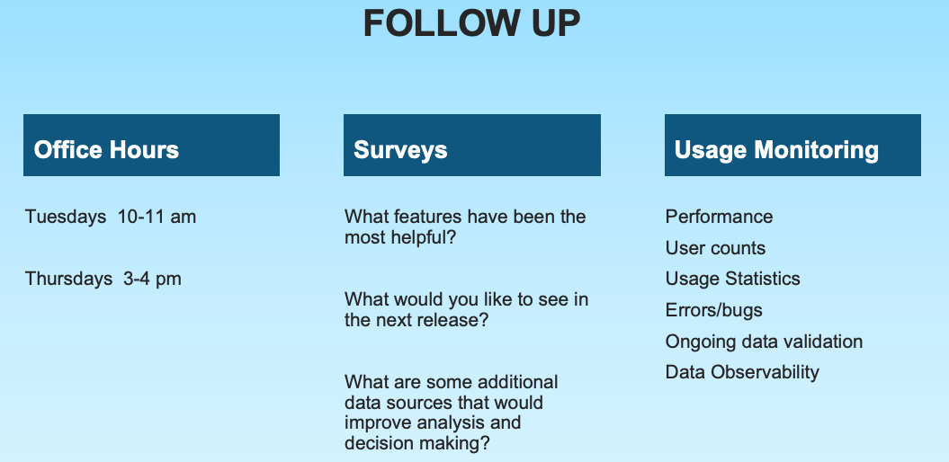
Don’t let all of that hard work go to waste
Conclusion
This article provided a summary of various data visualization and design approaches that I have found useful in driving adoption of dashboards, applications and other reporting solutions that present information. Additionally, it described how important preparation and communication are in the delivery of these solutions to business users at all levels of an organization.
PREPARE
DESIGN & DEVELOP
DELIVER
Comments
-
Thanks for sharing!
4 -
Can I steal this? This is great stuff - would love to show to clients (specifically 'Deliver' portion) for better adoption!
4 -
No, thank you @keithsmith22 for writing this up and giving everyone a good guide to consider from a variety of angles.
And welcome to Astrato Galaxy!
1 -
Awesome read @keithsmith22, thank you for sharing this insightful content!
0